I am now going to begin looking at different fonts and colours that I can use within my practical piece and also explore the different techniques within affinity designer that I can use to create the best possible graphics on my infographic. I am also going to look into the connotations of colours and fonts , what they mean when you first see them but also the deeper meanings behind them and what can be decoded from them.
Type faces and the way that they are used evoke great emotion which is why i want to focus on using them in the correct way in my posters . Type can be seen as mirroring the emotions we display in the real world. I want my target audience to understand my infographic and be interested in it from the first glance.I don’t want to be using lots of elaborate text within my posters that I create as this isn’t suitable for my target audience. I need it to be reader friendly and also clean and easy to read due to the fact that infograhics are a way of condensing lots of information. I found out that by using different types of fonts the audience can determine the most important points of your presentation just by looking at it. This also makes it easier for them to follow along.
Font choices are what people see at first glance and people may judge the rest of the poster purely through the font choice. They often set the tone for the whole design and they can also influence people who are looking at the posters in terms of interacting with the design. ‘bad typographic choices always distract from your design’s message and intentions.’ Type influences what we read and affects our choices because we all instinctively understand what it is trying to tell us.
Typefaces have their own personality and its important that I determine what font fits best with what I want to achieve with my target audience. My target audience is mainly people aged 18-24 as this is the biggest demographic who use Instagram, therefor I want something that looks fun and eye-catching but also serious at the same time due to the fact I am aiming to raise awarness of the negative effects fashion is having on the environment. I am going to create a moodboard full of different type faces , colours and images to use on my infographic.
The best typography for infographics
People are definetly more likely to be inpsired by visual based things that look good rather than big chunks of text on a page. 40% of people respond better to visual pieces rather than plain text. In addition to this , including an infographic on social media creates a higher potential of going viral. This is key for me and what I want to achieve out of my infographic as I am aiming to spread brand awareness and raise awareness of the negative impacts fast fashion is having on the environment.
There are three main font families: serifs, sans serifs, and display fonts. Each font family has different purposes and common uses among designers.
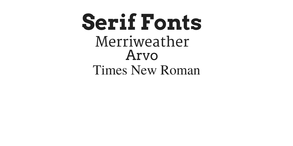
The reason why people tend to use these type of fonts is because they are easier to read. Our eyes are almost accustomed to reading them because its the type of font that usually appears in newspapers and books that we read on a regular basis.
Sans serifs are best for section headers and large titles. Since I am producing an infographics I am going to use these types of fonts to try and draw engagement because they are larger. They are really easy to read which is certainly suited to my infographic as it is based at a younger target audience.
.png)
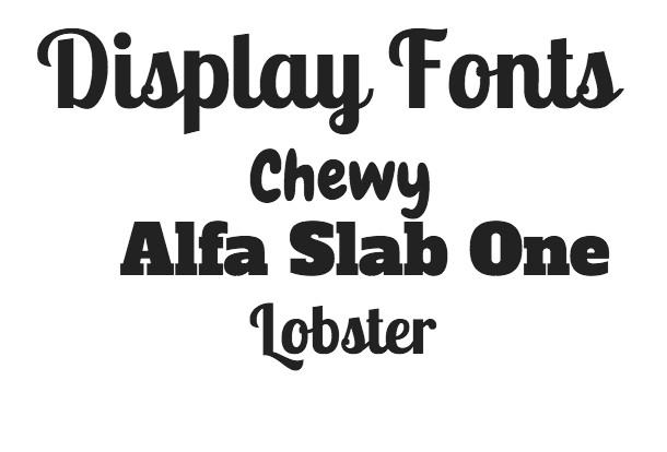
Display fonts are a type of fonts that are playfully designed. Designers agree display fonts should really just be used as headers to set the mood and theme of your design. Some popular display fonts are Alfa Slab One, Lobster, and Chewy.
The font used on the Infographic is really important as it has to match the theme and what you are trying to show. I want to inform my audience of the pollution that fashion is causing for the planet without us realising it. With this being said , I think I am going to take a more professional but simple approach with the font I am using. This makes it a lot easier for my target audience to read and understand.
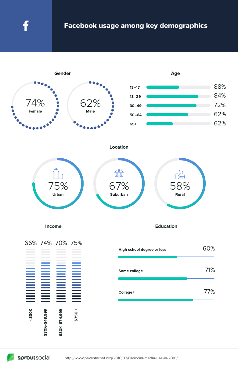
Here is an example of an Infographic. The cretaor is using san serifs throughout and it is extremley effective.
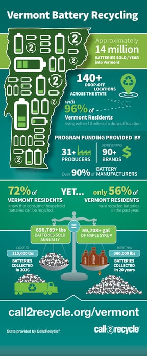
It is very futuristic and it has an informational design that compliments the topic which is encouraging battery recycling for our planet. This is a very similar topic to mine so I can take inspiration from this in terms of the layout and the fonts used throughout. As I found out in my research on colour theory and colours alongside marketing , different shades of green are used on the infographic which is what I decided I was going to use on what I produce as it is not only in keeping with RE-gains logo , but it also represents a new lease of life.
References
Hyndman, S. (2016). Why fonts matter. London: Virgin Books.
Blogger, G. (2020). How to select the best typography for your infographics. [online] Marketing-partners.com. Available at: https://www.marketing-partners.com/conversations2/how-to-select-the-best-typography-for-your-infographics [Accessed 8 Jan. 2020].