I have had a look at some other existing infographics related to fashion and recycling in order to get some inspirations of colour schemes and images for my own infographic.

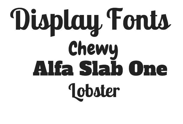
This is a colour scheme that I love. Black and grey are both bold and modern colours. I carried out some research on the colour theory in order to look at what colours evoke not only emotions but how they make a certain brand look. Black especially is an extremley bold colour and this is colour that runs throughout re-gains website and advertising. The contrast with this against pink works really well in my opinion. Black almost makes any colour look better. Pink is a youthful , feminist colour and is very symbolic of fashion. It is engaging for an audience and the aspects of white and silver alongside these colours create a very modern and sleek finish to the Infographic. It is clear what the infographic is based on and that they have used sans serif fonts in order to make it easy for an audience to read. Just from the first glance this got my attention and I want to continue to read what else is written.

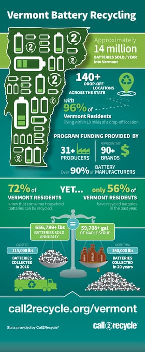
This infographic consists of yellow / orange tones and a calming blue tone alongside some bold colours like black and red that are very minimilistic in this poster. The orange and yellow tones are earthly and evoke a friendly image for the infographic. The style of the font used is very friendly and easy to read however the colour in some cases does make it harder. Simple effective images are used again to go alongside the facts and statistics. A lot of them are in red which create a sense of urgency and straight away the attention is drawn straight to the writing in red. The downside of this is that there are some chunks of larger text which can be disengaging for an audience and since I am aiming it at a younger set of people, I want to avoid this and condense the information I have found out in research as much as I can.

In this infographic , the colours blue and pink are very evident throughout. Blue is a very calming colour and contrasts really well with the neutral pinks and greens that are used here. Again the simple images that are used work really well with the information that is put across. The percentages and statistics are in larger fonts so straight away you notice them and are engaged.

Lots of the greenery is used throughout this infographic and again the colour red which creates the sense of urgency. Green is the colour that is used in the re-gain logo and all throughout the website due to its relevance with recycling. The layout , images , text and headings are all set out well which makes the infographic easy to follow however , the background and colour theme for me is less engaging than the rest.
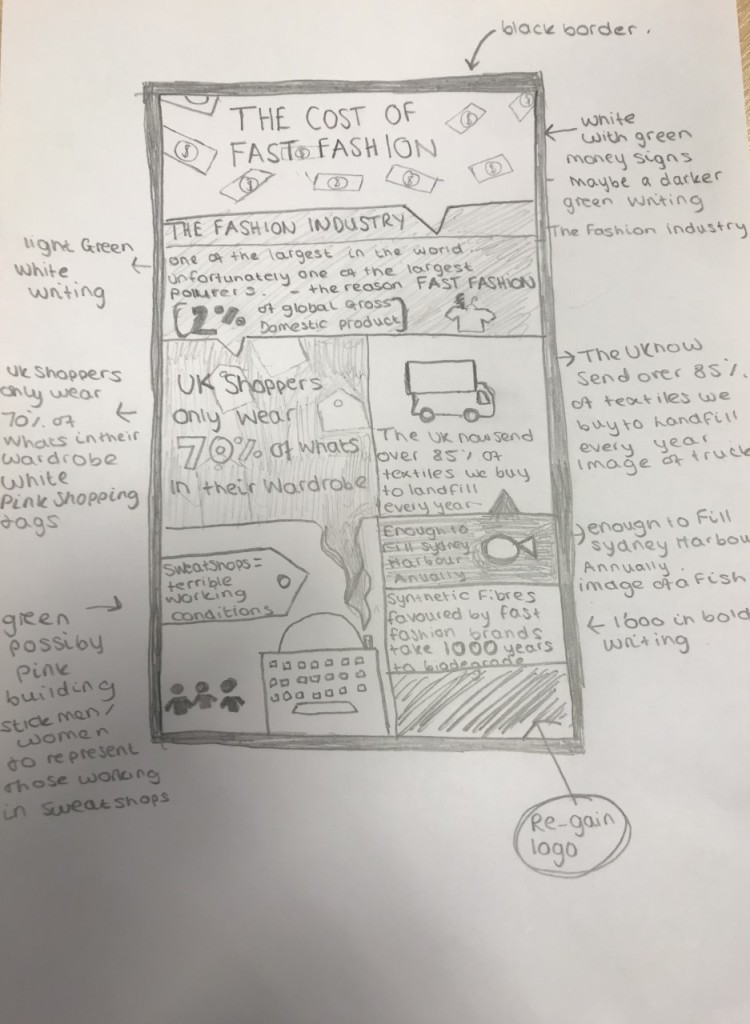
Here is a draft infographic that I have produced. I have chosen the most relevant and the most interesting information to include on the infographic. (The Fashion Industry is one of the largest in the world however it is unfortunatley one of the largest polluters, the reason being fast fashion. It is 2% of the Global Gross Domestic Product. UK shoppers only wear 70% of whats in their wardrobe and the UK now send over 85% of texttiles we buy to landfill every year , that is enough to fill sydney harbour annually. Synthetic fibres favoured by fast fashion brands take 1’000 years to biodegrade and people working in sweatshops providing fast fashion work in terrible conditions) This is all information that I have researched and found out. To go alongside this I have selected some different simple images.
I am going to stick with theme of black , green and white with some neutral blue and pink colours for the image. I want the infographic to be inkeeping with RE-gain and the colours that are used throughout their website and social media pages. Furthermore I want it to be engaging at first glance and easy to read for my target audience.


.png)